


Responsive websites looks beautiful on all screen sizes. This post is on a simple but useful Google Chrome app Resolution Test for website owners, developers and web-designers so that they can easily test their web pages in different screen resolutions using an option to define various screen sizes.
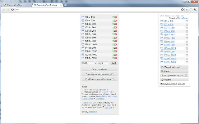
Resolution Test changes the size of your web browser so that you can test test your or your client’s website in various screen resolutions. It comes with preset resolution sizes but provides you a feature to specify custom screen sizes and see how your website look in them.